
Vogue is a fashion and lifestyle magazine published in 23 regions:


In terms of lexis, this issue of Vogue conveys a much more formal register than the previous covers, this is demonstrated through the use of latinate lexis 'generation' 'extraordinary', which heightens the formality of the discourse. Vogue is a lot more positive than publications such as 'that's life' or 'chat', as it contains a much more optimistic lexical field 'revamp' 'fun' 'innovator', providing a publication that promotes a constructive and confident outlook, rather than focusing on the shocking bad stories.
It's important to note the use of a serif typeface with this magazine, amplifying professionalism and the sophistication of the overall aesthetic. Vogue is known for being a classy magazine, so the cover should reinforce this notion. The larger type featured on the composition 'Kate's world' and 'Autumn style', although large and eye catching, do not have the same tone of voice undertaken with previous analysed magazines. These adopt a formal and gentler tone through the usage of regular grammatical capitalisation, which contrasts with that's life/chat's full uppercase titles. This lowers the volume and again excentuates a classier tone of voice that will appeal more to higher class women due to their perhaps increased maturity levels. Italic serif seen here is decorative and conveys emphasis, and utilising lowercase lettering, this demonstrates a classy and elegant aesthetic. Using italic type contrasts with the usage of uppercase type within a sentence as seen on other publications, in order to emphasise.

Full bleed imagery is popular within more luxurious magazines. An example here is the cover of ELLE, a lifestyle magazine with french origin published worldwide. Here demonstrated on the cover is a full bleed image of Kylie Jenner, an iconic face amongst contemporary pop culture. The full bleed imagery manages to capture attention whilst also maintaining a classy aesthetic.
Similarly to the other lower class publications, type has been emphasized by the use of bright yellow and red, however due to the more organised composition, this does not have the same connotations. The bright colours in this case add a splash of colour, and alongside the single image this is not as overfacing and busy.
The tall narrow sans serif is modern and elegant, in contrast to thick, bulky type choices in That's Life/Chat.
Again, ELLE features a large serif typefaces which is very common for higher class magazines.
The use of alliteration is also apparent in this issue of Elle, similarly to the other magazines, however as said previously the connotationes of this structure are more positive 'brave bold beautiful'.
From conducting this analysis I have found some key aspects of women's lifestyle magazines which are catered to a higher class, including serif fonts, organised layout, narrow clean typefaces, full bleed imagery and one key bright colour within a neutral colour scheme.
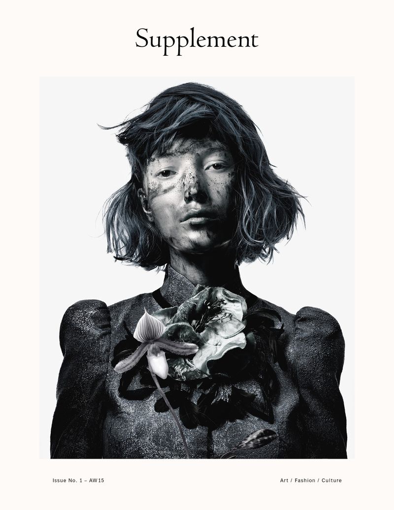
I chose to analyse a couple of less mainstream 'arty' magazines usually found in more creative shops. Supplement can also be found in popular high street book & craft shop WH Smith. The cover for Supplement is immediately calming, conveyed through the use of a relaxed and sophisticated lowercase serif with a thin delicate font weight for the title. The use of this typeface insinuates a serious tone alongside the latinate term 'Supplement', the placement of the title is dead in the center, evoking impact and allowing the eyes to naturally read this.
In terms of content, this is not featured on the front cover like the other examples. In doing this, there is a lot of breathing space, creating more impact on the image and title. This approach is minimal and clean, but does not contain any content to initially draw an audience in. This is the reason publications such as Supplement may not appeal to an audience that demands shocking and 'cheap' content that appears in other 'lower class' lifestyle magazines.
There is a very minimal amount of text at the bottom of Supplement which contains the basis of the magazine, 'art / fashion / culture' & 'issue no 1', this has a very sophisticated approach to displaying only the critical information, and I will be taking note for use in my own redesigns.
No comments:
Post a Comment